Cyberpunk 2077 Review
What is Cyberpunk 2077?
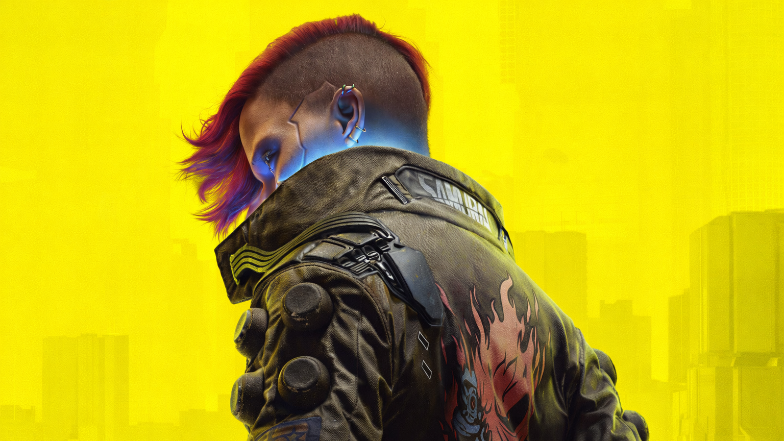
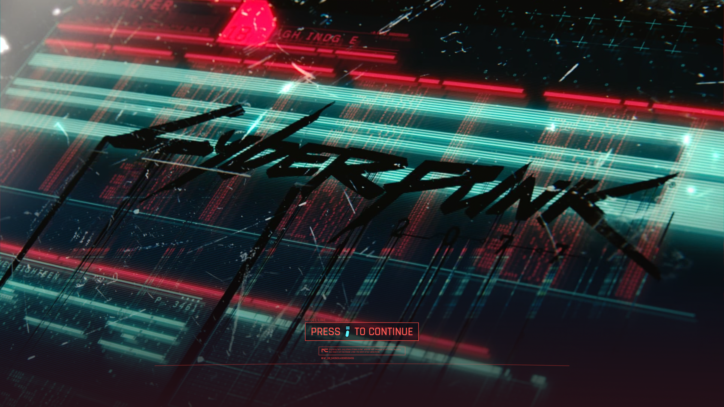
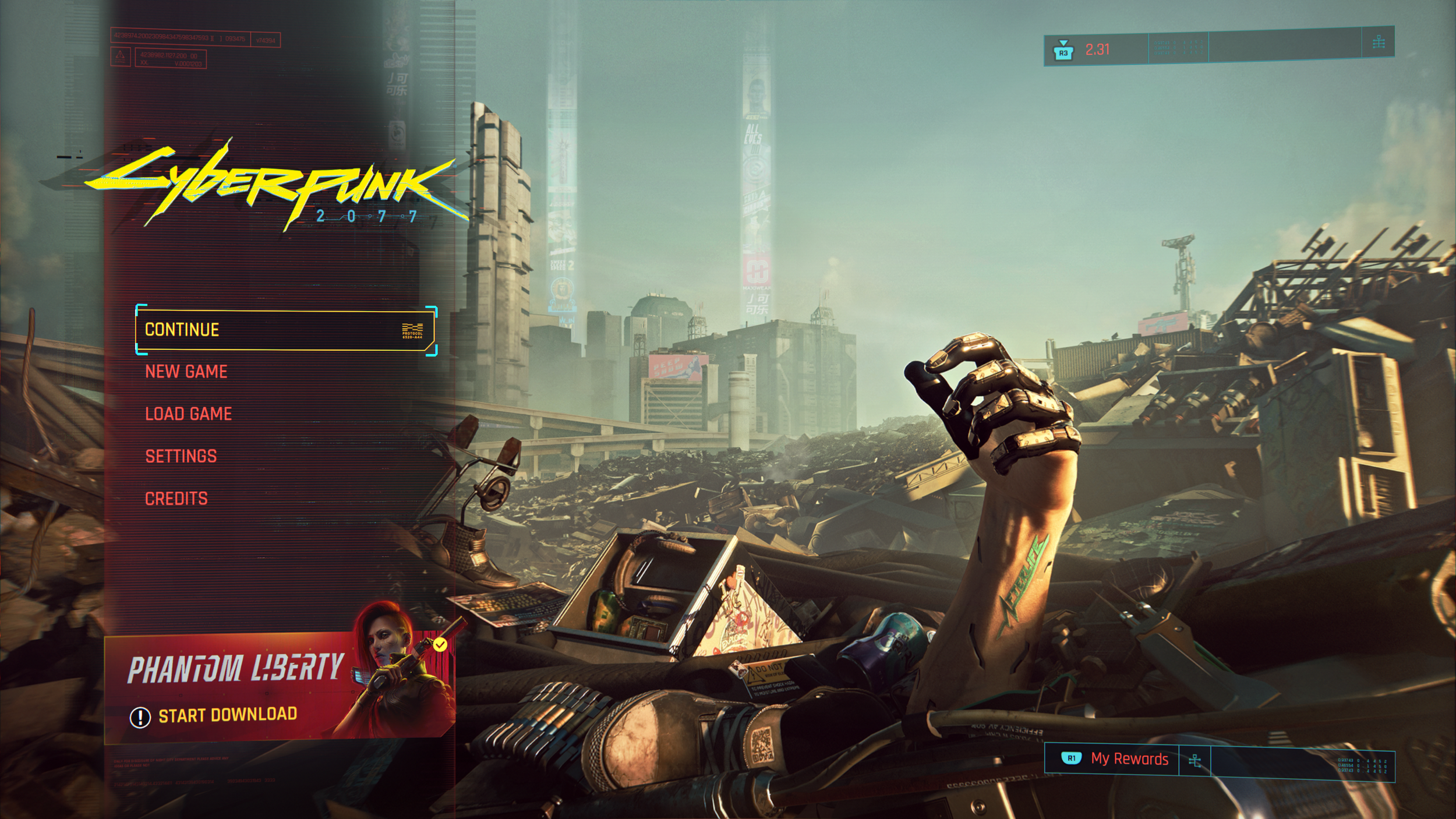
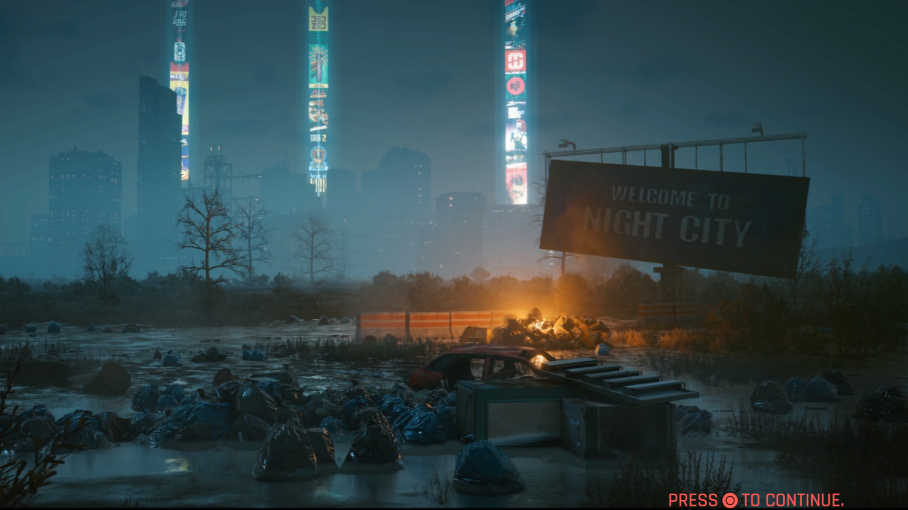
Cyberpunk 2077 is an open-world, narrative-driven role-playing game developed by CD Projekt Red. Set in the futuristic dystopia of Night City, the game immerses players in a sprawling urban environment filled with dynamic systems, branching stories, and a high-tech aesthetic. Players assume the role of V, a mercenary navigating a world shaped by cybernetic enhancements, corporate control, and moral ambiguity.
From a UI perspective, the game features a distinct neon-infused interface, angular design language, and holographic motifs that mirror the world’s cyberpunk ethos. Its interface serves both aesthetic storytelling and player immersion, blending world-building with gameplay systems.
Why Cyberpunk 2077?
Cyberpunk 2077’s visual identity is one of the most iconic in modern gaming but its user experience and interface design have sparked ongoing discussion. While the style perfectly captures the mood and tone of its world, certain aspects, such as readability, immersion, navigation, and menu architecture, present opportunities for refinement.
As a UX designer who has spent countless hours playing the different storylines of this game, I was motivated to explore how a redesign could improve usability while maintaining the fascinatingly unique, high-tech, punk aesthetic that defines the Cyberpunk brand.
Colour, Contrast, and Accessibility
Cyberpunk 2077’s colour palette is visually striking and strongly reinforces its futuristic identity, but in several areas it compromises usability. Certain interface elements prioritise style over clarity, which can make critical information harder to read during gameplay, especially in high-density or fast-paced moments.
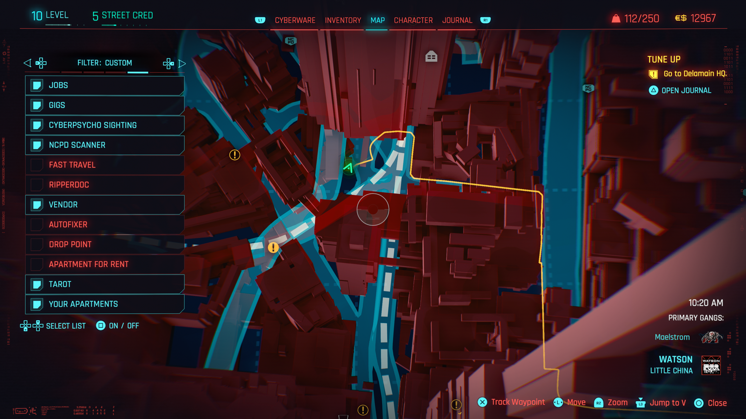
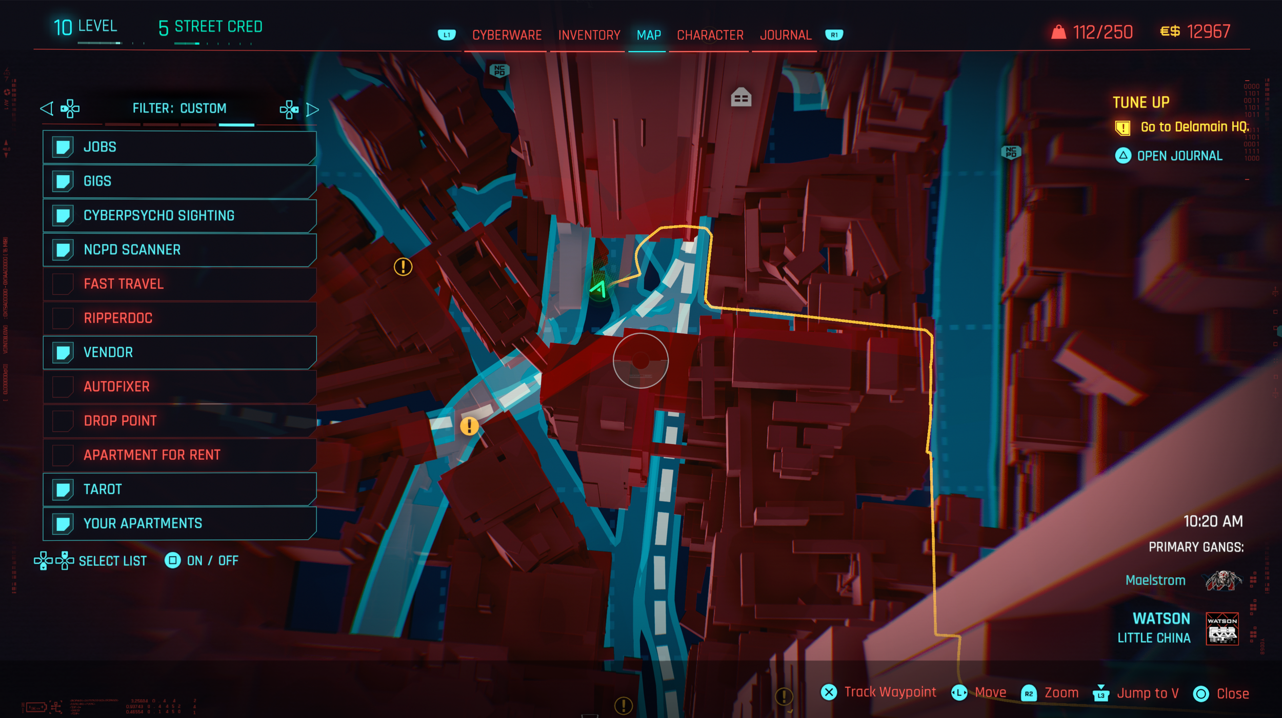
One of the most noticeable issues is the use of red text against red map backgrounds, which significantly reduces readability. While accessibility options such as colour-blind modes exist, they require manual discovery and adjustment, adding friction for players who need them. In contrast, bright yellows and blues perform well against darker backgrounds, but the fuzzy, glowing red elements feel visually jarring and inconsistent within the overall interface hierarchy.
To address these issues, a dedicated bottom information bar with strong contrast would help separate essential information from the map background. High-contrast colour sets should be enabled by default, with accessibility options made more discoverable and easier to adjust. The signature yellow and cyan palette can be retained to preserve Cyberpunk’s identity, while reducing glow effects and red intensity to improve legibility and visual comfort.
Default Colours and Contrast
Overlay added to enhance contrast
Bottom bar in Electric Blue

Top bar in Yellow and Electric Blue
HUD (Heads-Up Display)
The HUD plays a critical role in communicating mission updates, player status, and moment-to-moment gameplay information. While it successfully delivers a large amount of data, its current implementation lacks clarity and readability, particularly when viewed from a standard couch-to-TV distance.
A key issue is the size and complexity of HUD button icons. Many icons are too small to be easily read at a glance, and their designs include extra visual details that add unnecessary complexity. This combination makes it difficult for players to quickly interpret information during fast-paced gameplay, increasing cognitive load at moments when attention should remain on the environment.
Improving the HUD starts with increasing icon size and spacing to enhance legibility. Although this can be adjusted through accessibility settings such as “larger HUD elements,” this level of readability should be the default rather than an optional workaround. Simplifying icon designs and focusing on clear shapes and strong silhouettes would ensure that information is instantly recognizable, even from a distance or during high-action scenarios.
Default HUD
Larger HUD Elements for better clarity at a distance
HUD Lens Distortion and Visual Effects removed
Icons simplified to decrease cognitive load
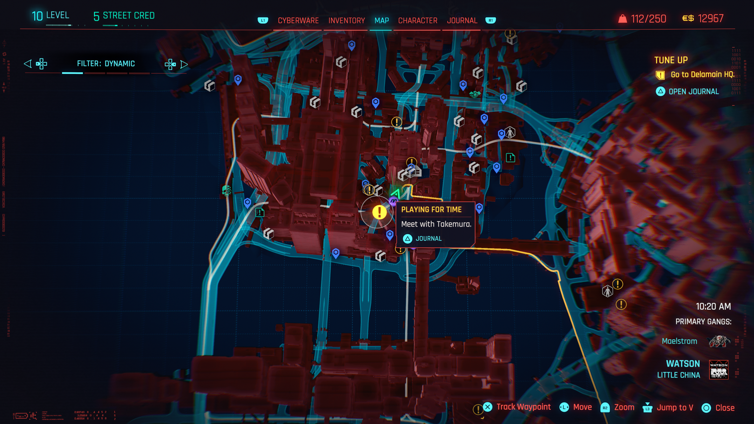
Map Icons and Visual Hierarchy
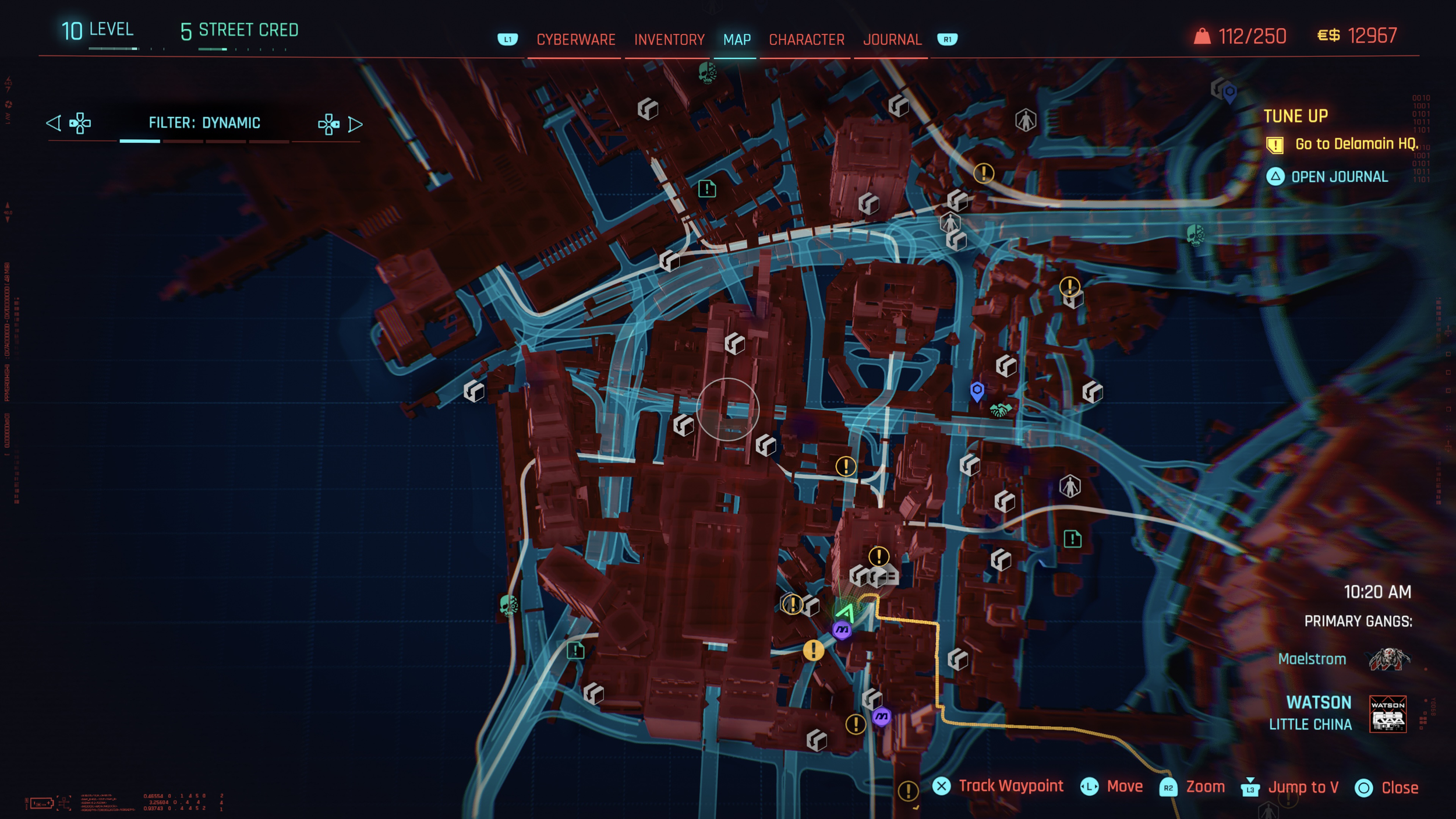
The map provides a large amount of information, but the way it is presented can feel overwhelming and difficult to parse. Visual clutter and a lack of clear hierarchy make it harder for players to quickly understand what they are looking at or decide where to go next.
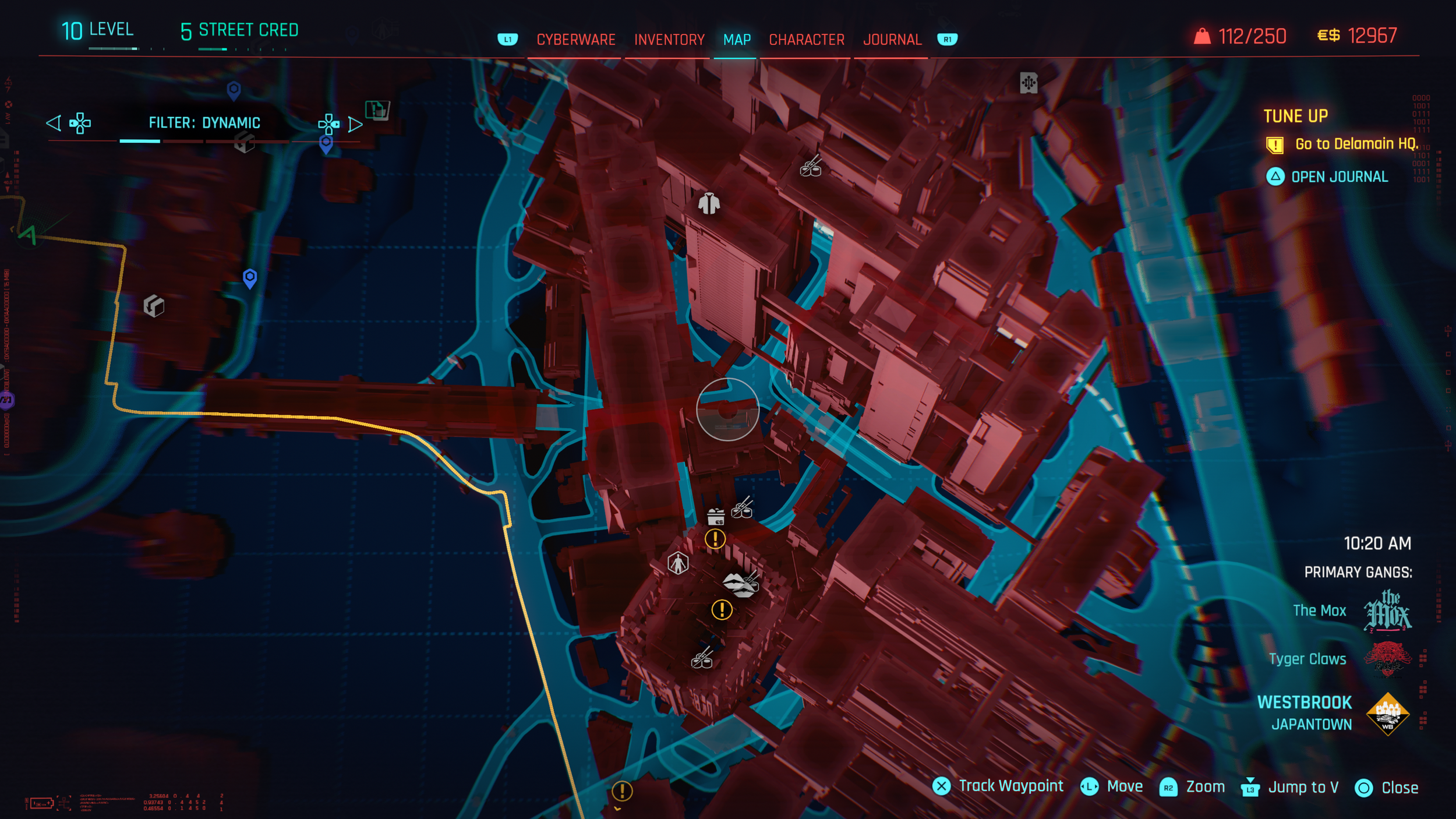
One of the main issues is that map icons do not have persistent labels and can only be identified when hovered over, which slows recognition and increases cognitive load. There is no legend to explain icon meanings at a glance. In addition, the map is densely populated with fast-travel points, which not only adds noise but also discourages players from exploring the city naturally.
To improve usability, icons should be included alongside category names in the Custom Filter list to strengthen recognition. Simplifying the map by reducing fast-travel points to one per district would significantly cut down visual clutter and encourage players to explore Night City on foot or by vehicle, reinforcing immersion and discovery.
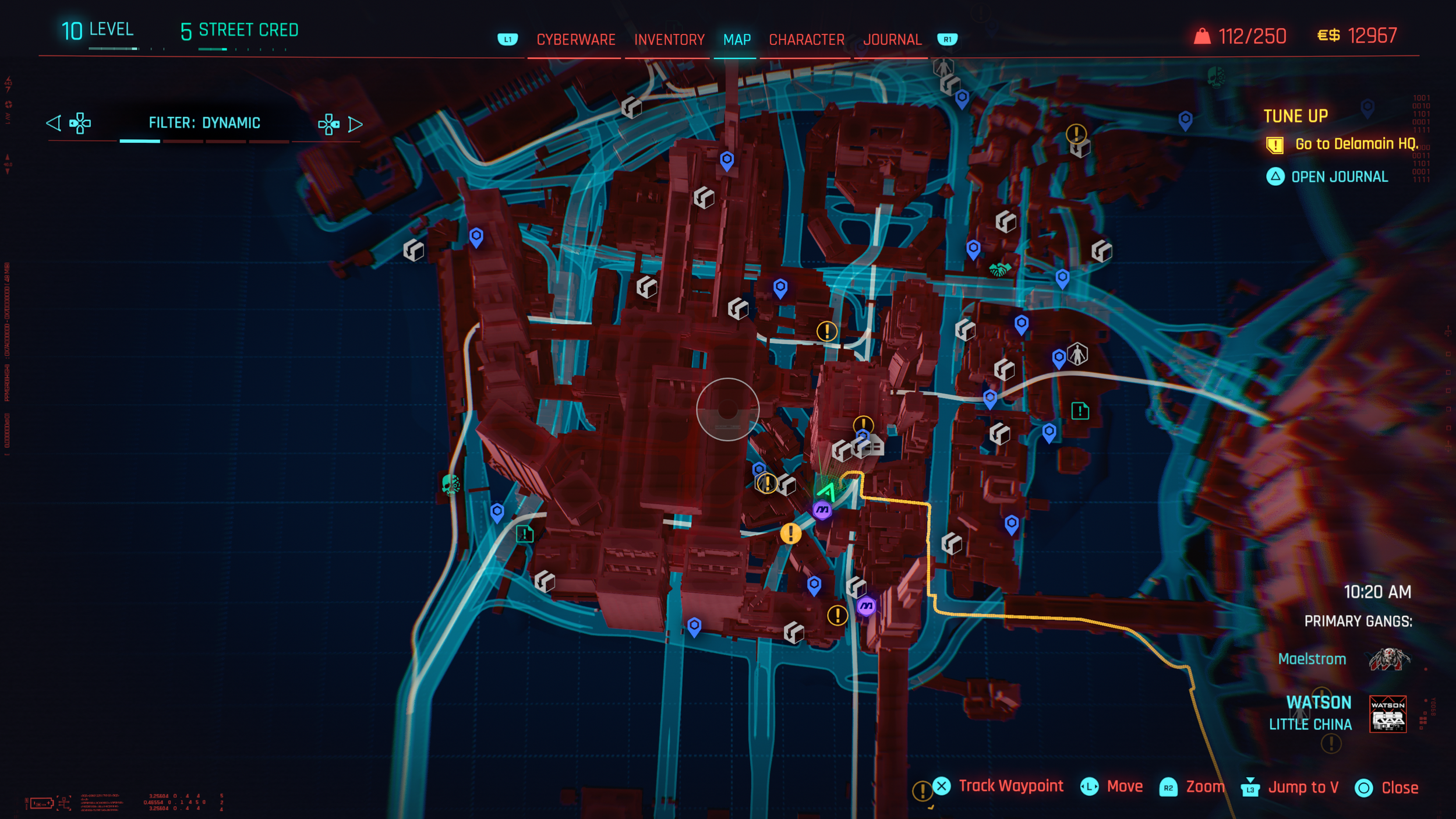
Map icons without labels
Hover reveals details

Missing map legend to explain icon meanings at a glance

Adding icons increases recognition and usability
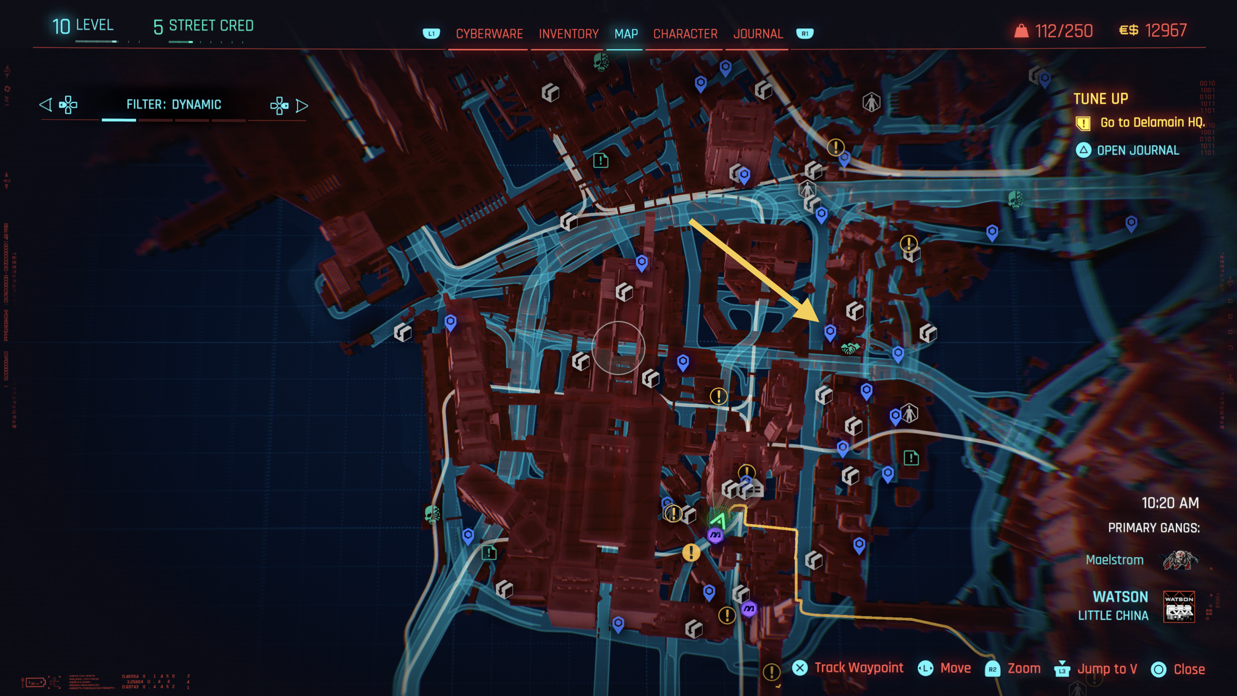
Several fast travel points (blue) increase visual clutter
Limiting fast travel points to one per district enhances clarity and encourages world exploration
Inconsistent Input Prompts
The onboarding and introductory flow relies on multiple “continue” prompts, but a lack of consistency makes the experience feel fragmented and unpredictable. Instead of reinforcing learned interactions, the interface forces players to repeatedly re-interpret how to proceed.
A key issue is that different intro screens use different buttons to continue, such as ⓧ on one screen and ⓞ on another, despite performing the same action of proceeding to the next screen. These prompts also vary in visual style and placement, which breaks muscle memory and increases friction during what should be a smooth introduction to the game.
According to Playstation, the functions for PS5 DualSense™ wireless controller buttons are:
Options button: Displays the options menu,
Cross button: Selects the highlighted item, and
Circle button: Cancels a command.
It would be recommended to standardize all “Proceed” and “Continue” actions to Cross button ⓧ, to align with PlayStation UX conventions, improve predictability, reduce confusion, and help players build confidence early in the experience.
Screen 1: Continue action mapped to Options button ☰
Screen 2: Continue action mapped to Cross button ⓧ
Screen 3: Continue action mapped to Circle button ⓞ
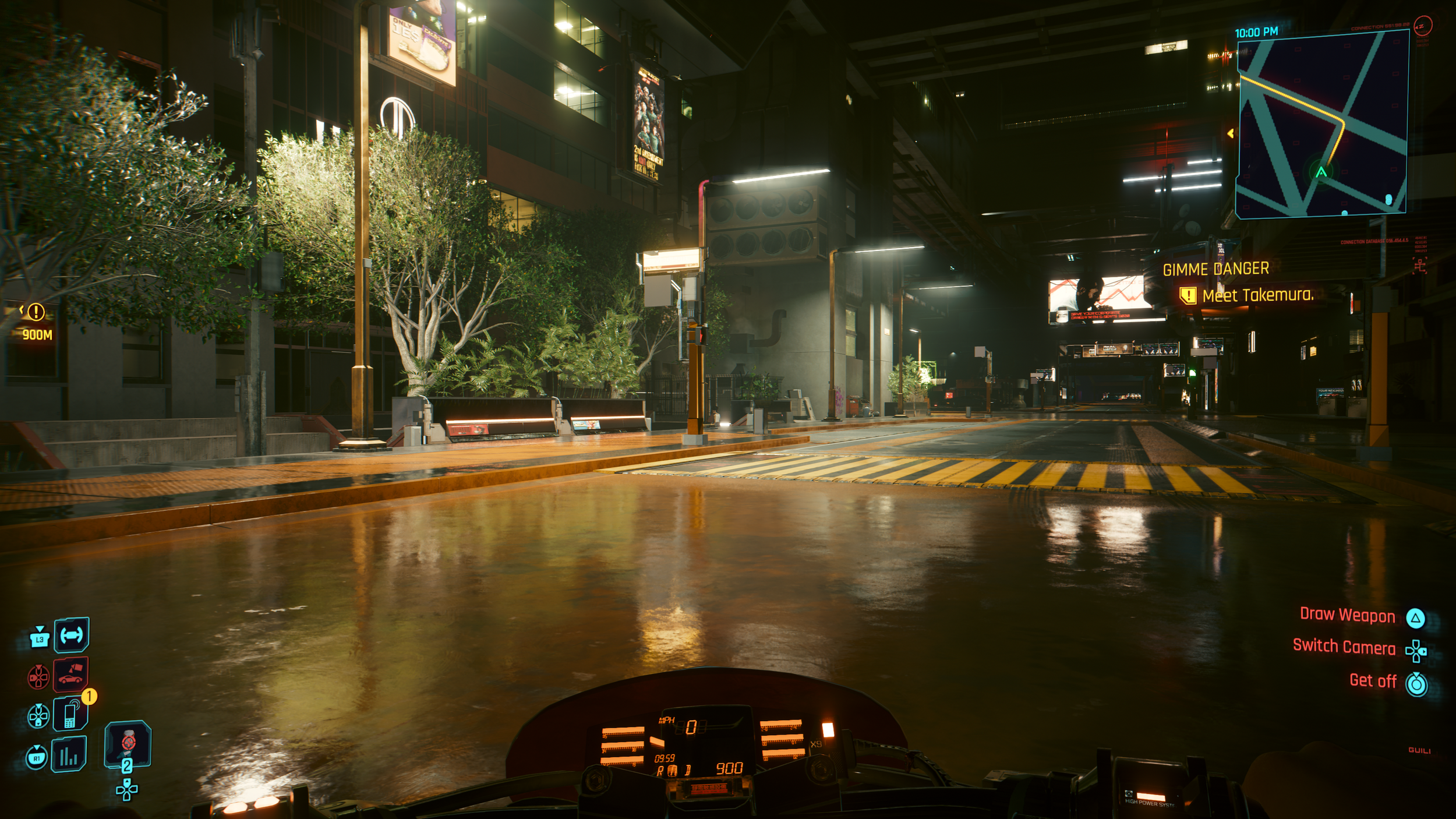
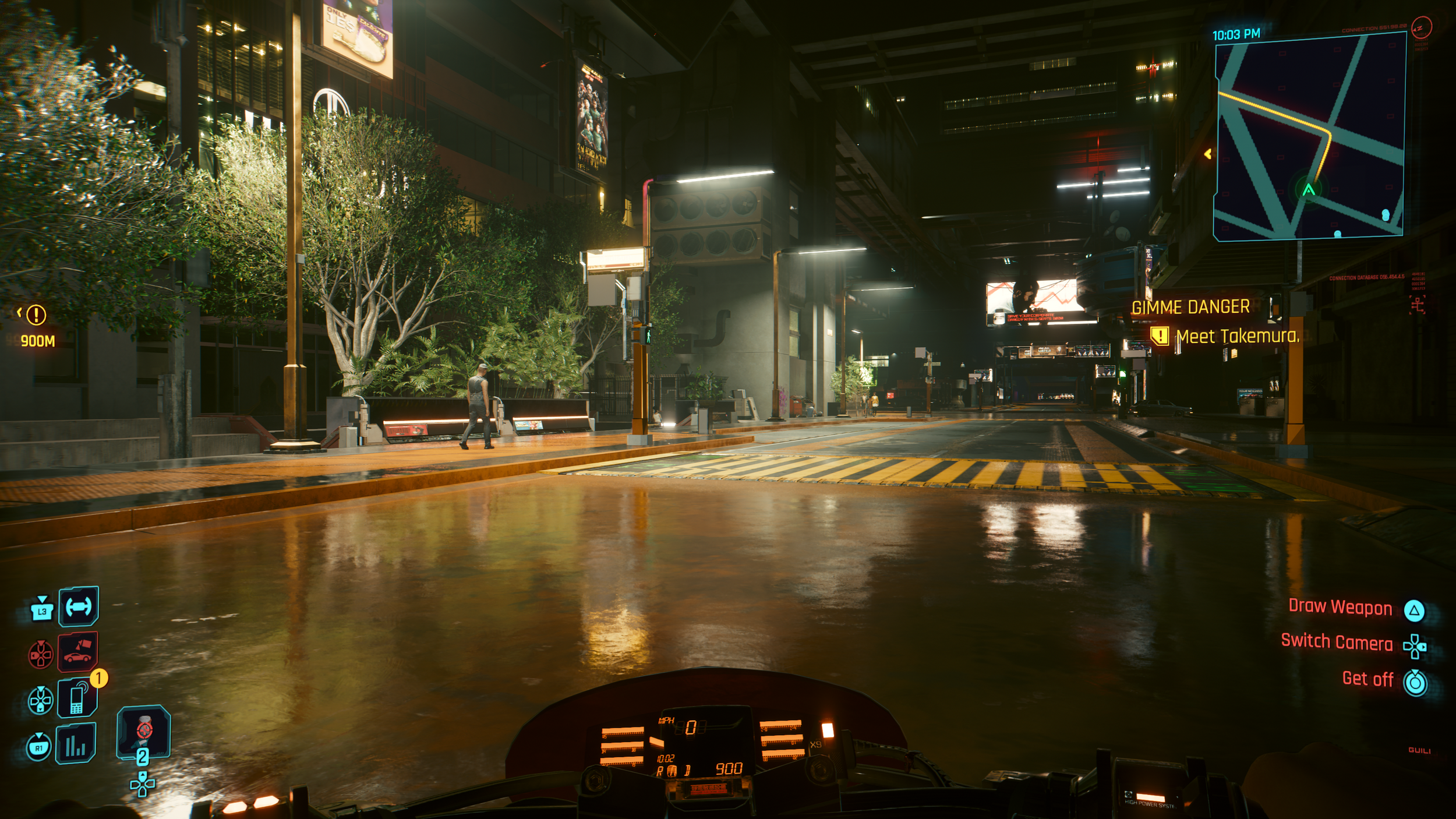
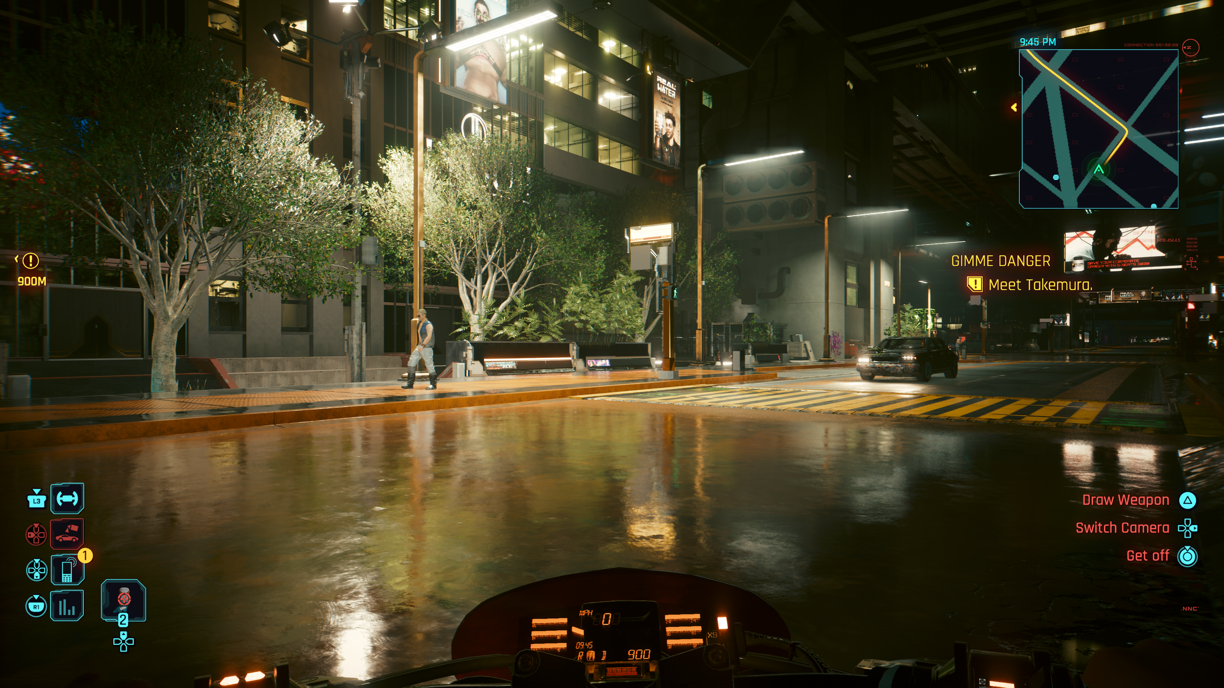
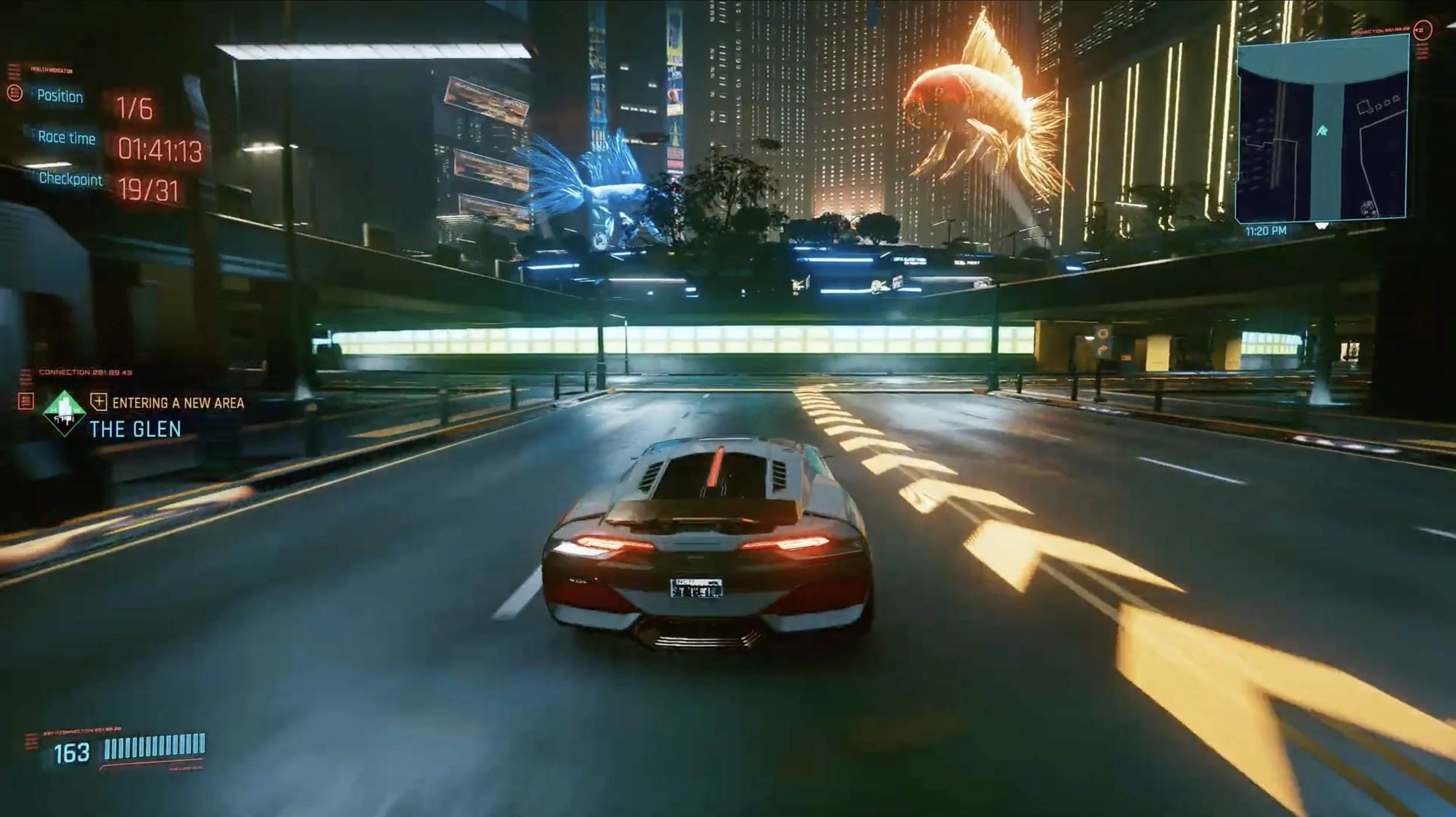
Driving Guidance and Player Focus
Despite the game’s futuristic setting, navigation relies heavily on a small corner mini-map, drawing attention away from the environment and reducing immersion. While driving, players are forced to focus on the mini-map instead of the road, causing them to miss hazards and details in the surrounding world that the Cyberpunk team has done a fascinating job building.
To improve this experience, navigation paths could be projected into the world using subtle holographic trails. Adding voice guidance or HUD-based turn indicators, similar to real-world sat-nav systems, would reduce cognitive load and keep players focused on driving. The mini-map’s vertical orientation also limits how much of the route ahead is visible. Tilting it slightly downward would expand forward visibility and better reflect real-world navigation perspectives.
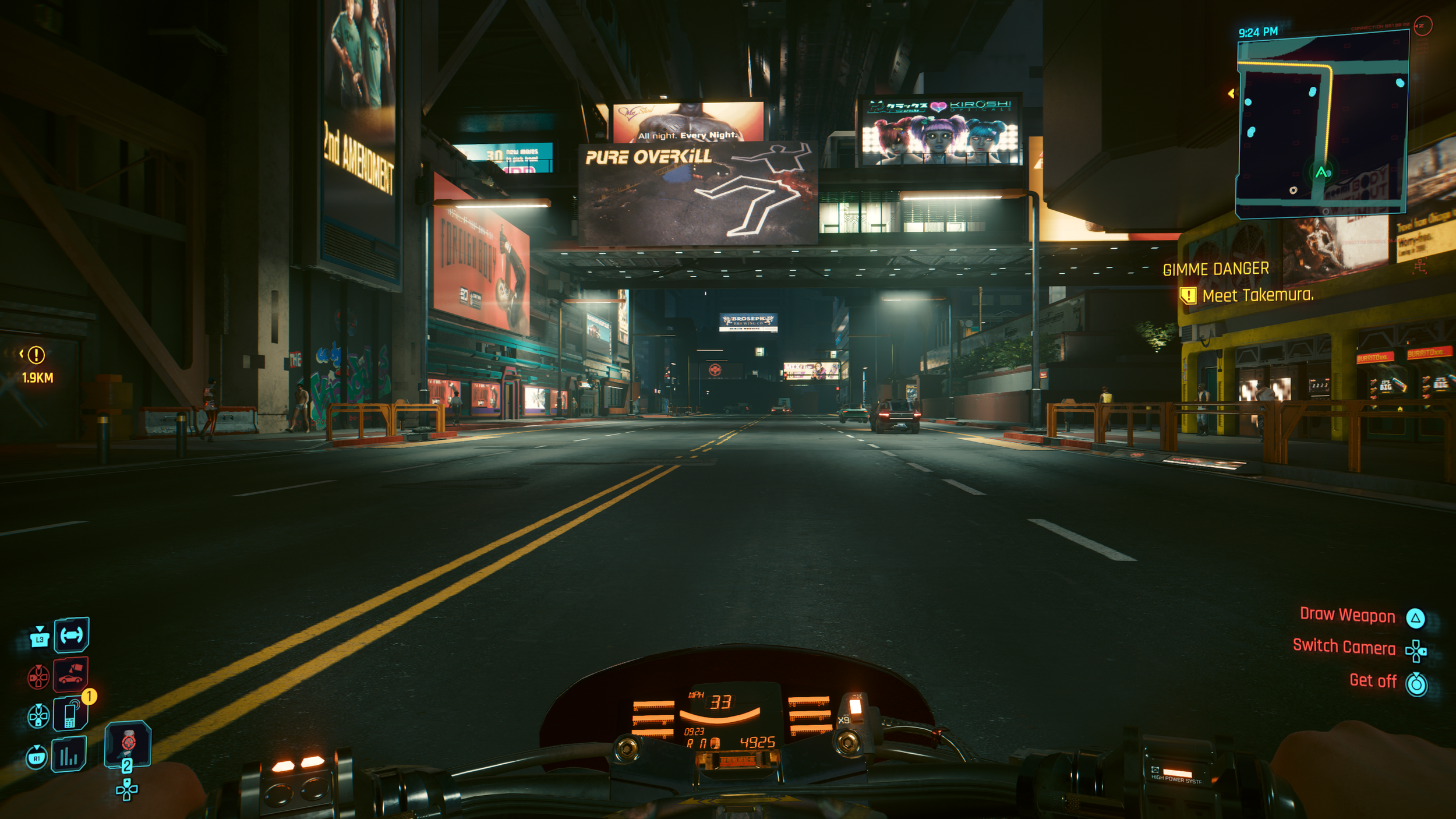
Player focus on mini-map for guidance
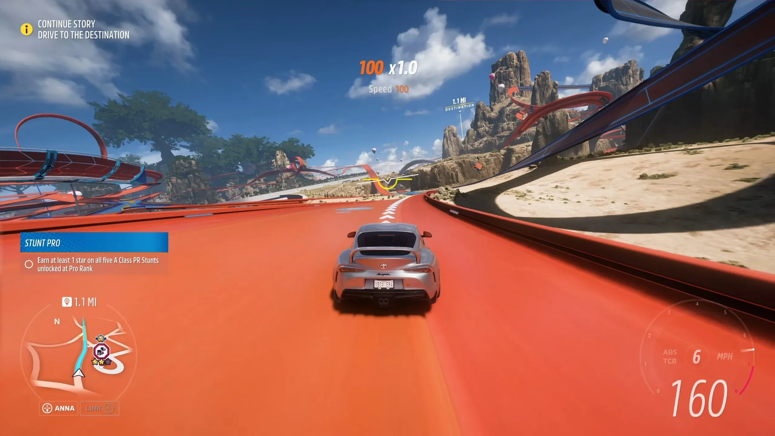
Forza Horizon 5 complements its mini-map with projected in-world route guides, reducing reliance on corner UI elements and preserving immersion during driving

The titled mini-map in Forza Horizon 5 helps increase forward visibility
Cyberpunk's side quest The Beast in Me introduces projected driving guides, likely due to its racing focus. However, extending this feature across the full game would significantly improve route clarity and create a more immersive driving experience
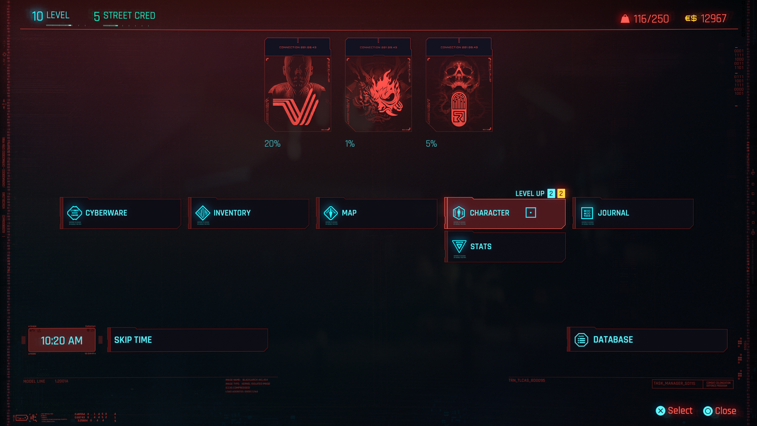
Menu Architecture and Terminology
The main menu structure introduces unnecessary mental load due to unclear labeling and overlapping categories. Since the menu contains extensive information, organizing it in a clear and minimal fashion would help user experience.
The Cyberware tab duplicates functionality already found under Inventory. The tab titled “Character” suggests visual character customization like outfits rather than skill-related information. Core Stats like total Health and Armour are buried within the Inventory instead of being clearly visible in the main menu, making essential player information less accessible.
Based on menu hierarchy and usage, Cyberware should be kept as a sub-category in Inventory and removed from the main categories. The Character tab should be renamed to “Attributes” or “Skills” to better reflect its purpose. Player stats should be prominently displayed within the Character section or made immediately visible upon entering the menu. For comparison, Fallout 4 presents key character information on the main Pip-Boy screen, where health, armour, damage, and level are instantly accessible rather than hidden behind secondary tabs.
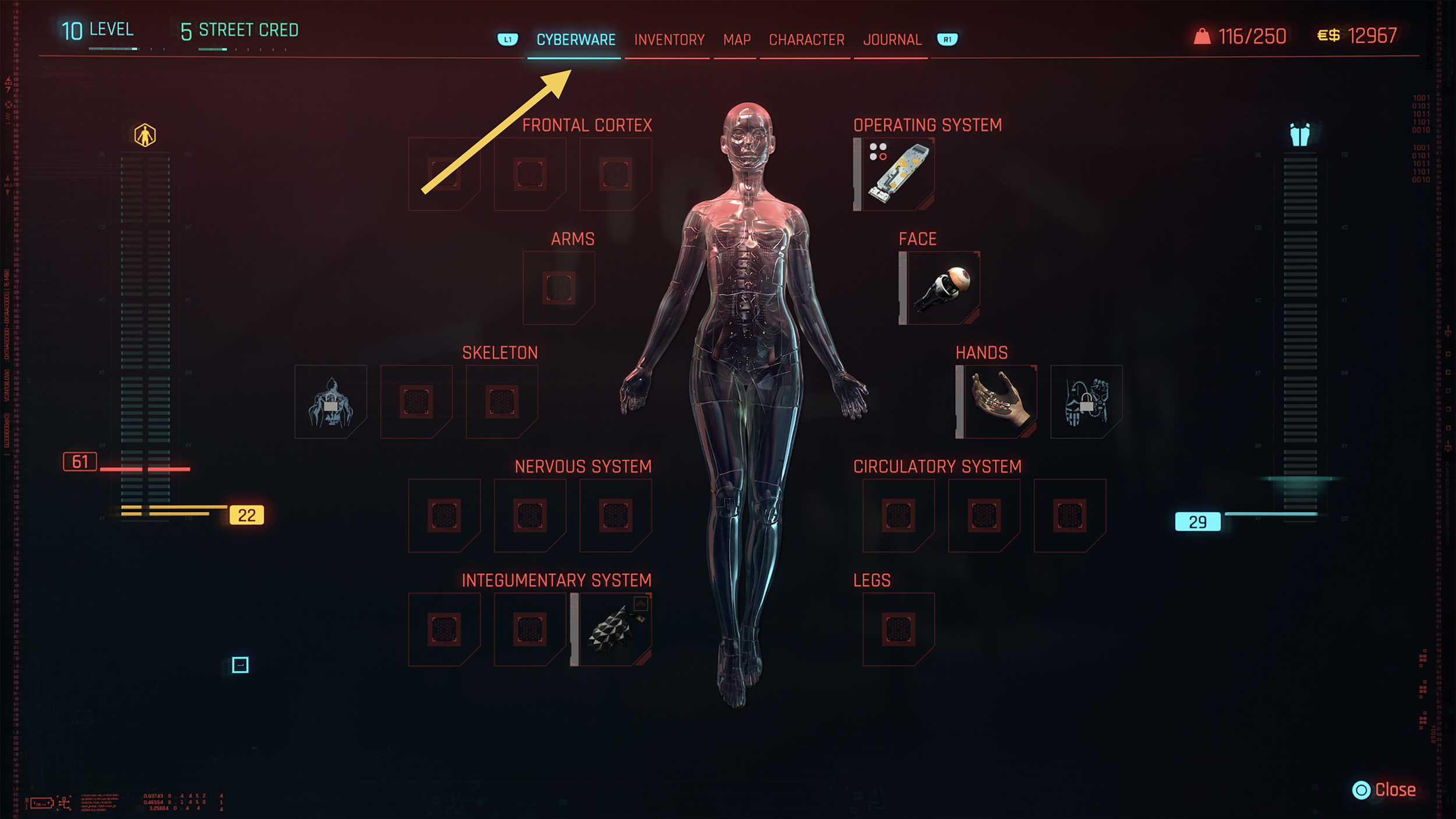
A separate Cyberware tab in main menu seems unnecessary
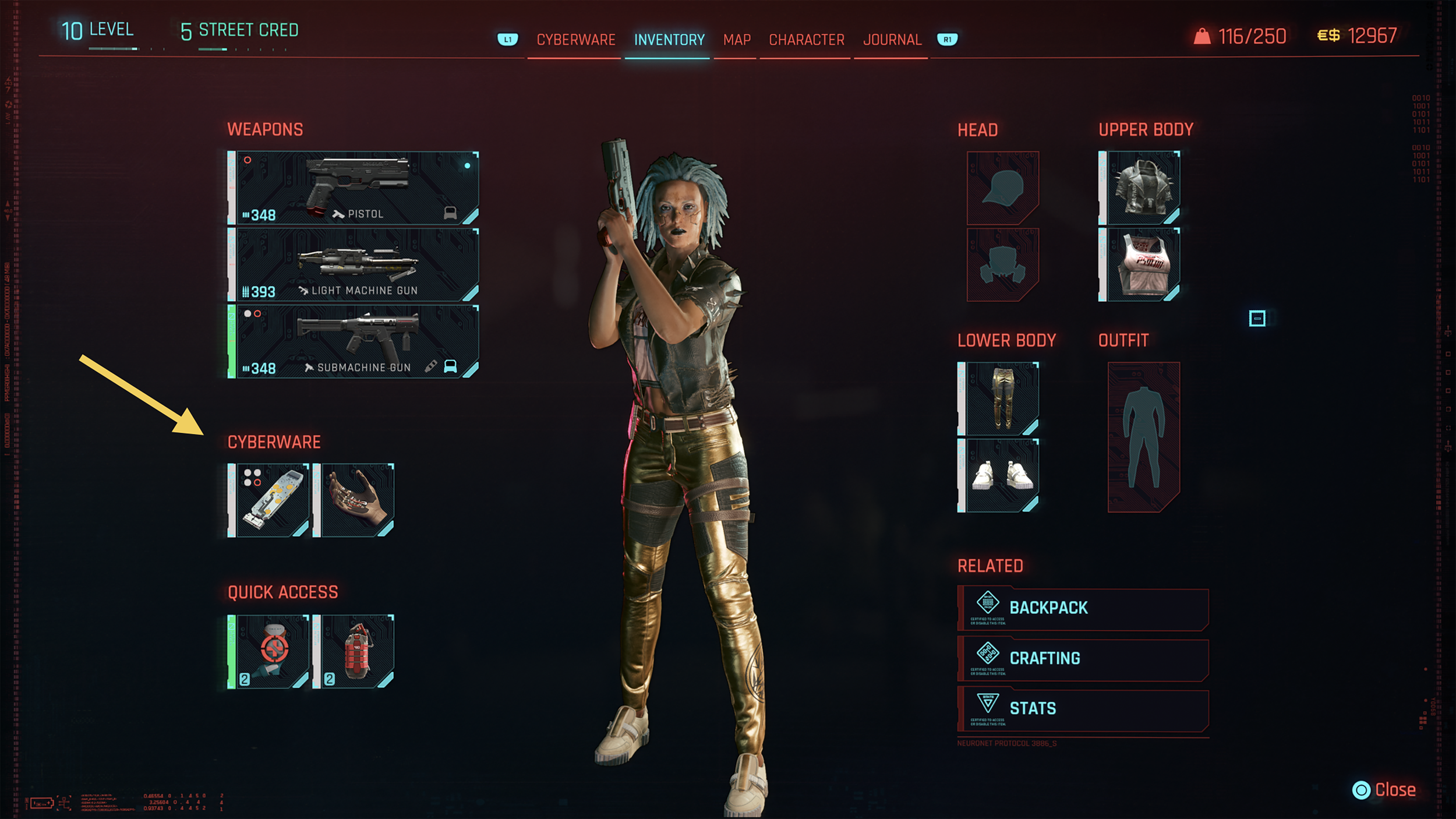
Cyberware is better suited to be a part of Inventory
Character tab implies character customization rather than skill progression
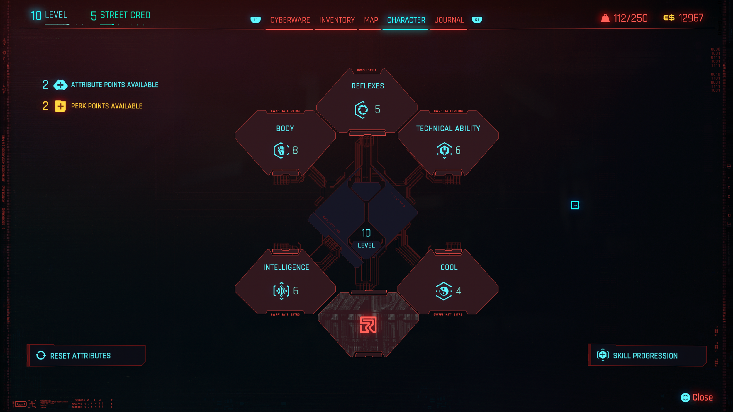
Rename Character to Skills to better reflect content
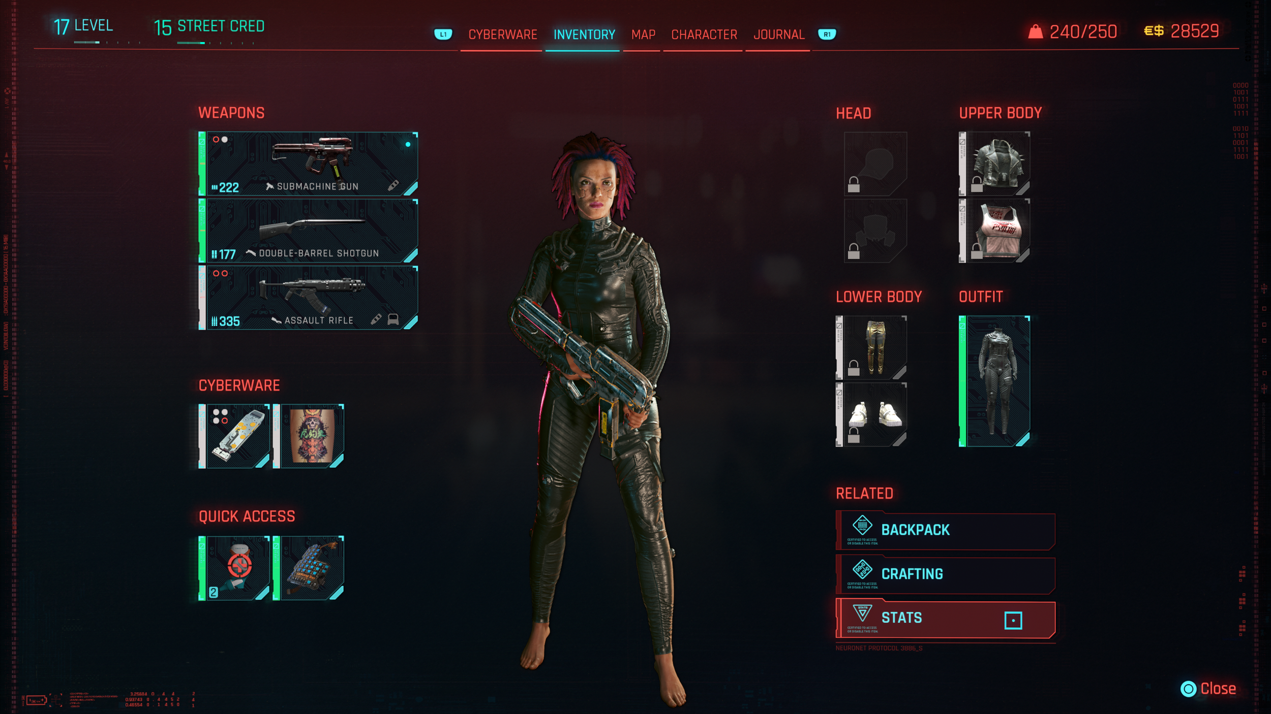
Core Stats like Health and Armour are buried within Inventory
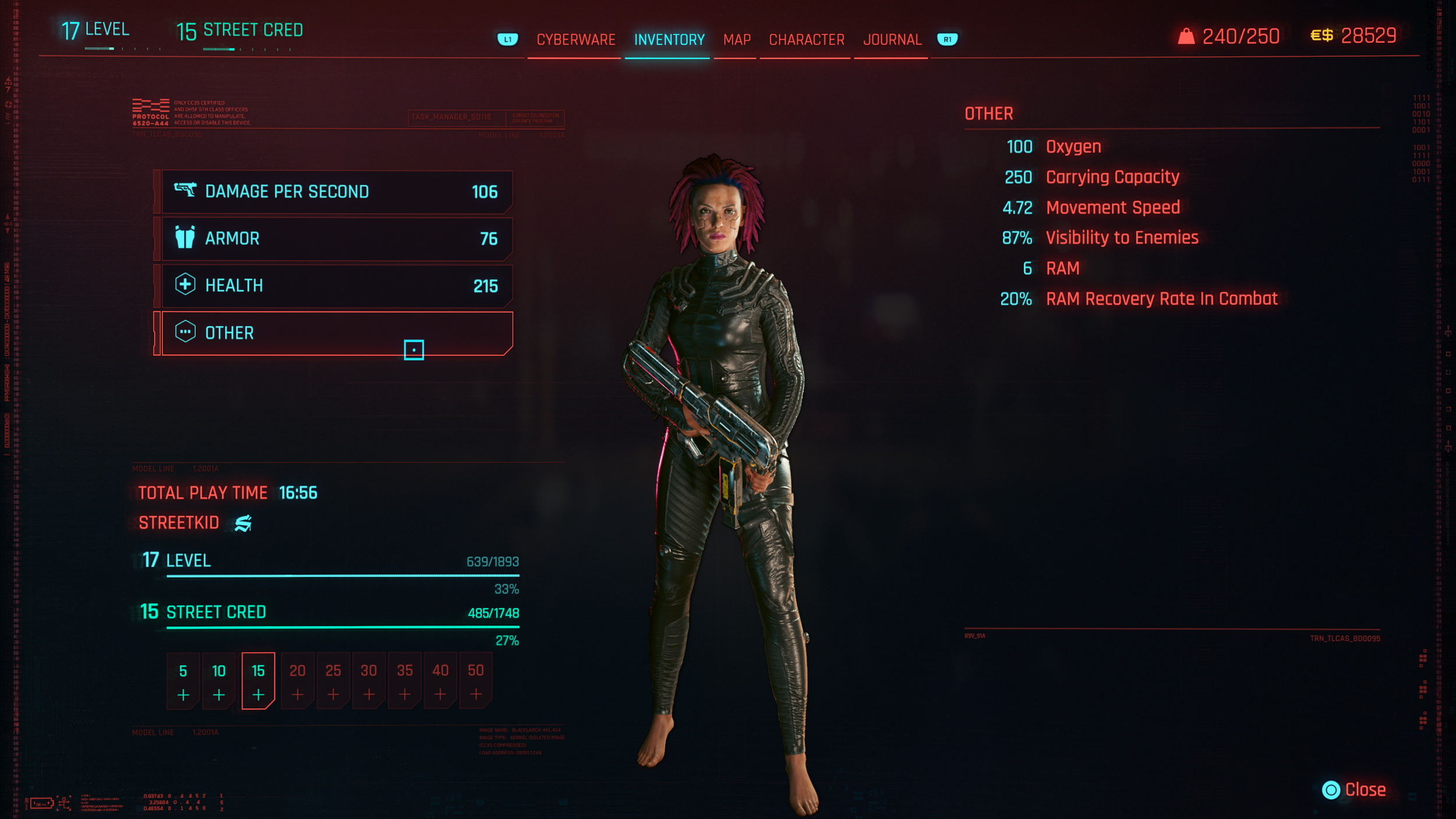
Stats would be better utilized if easily accessible
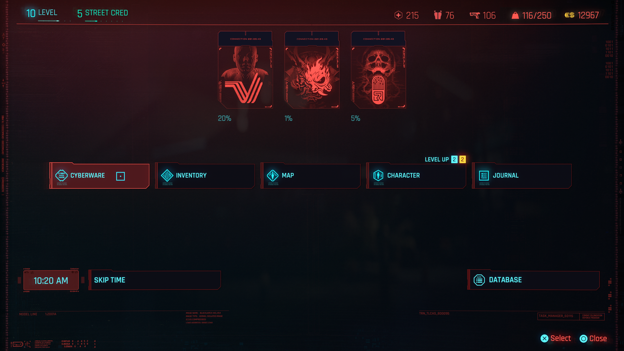
Header re-design to ensure Core Stats (Health, Armour, and DPS) are visible at a quick glance
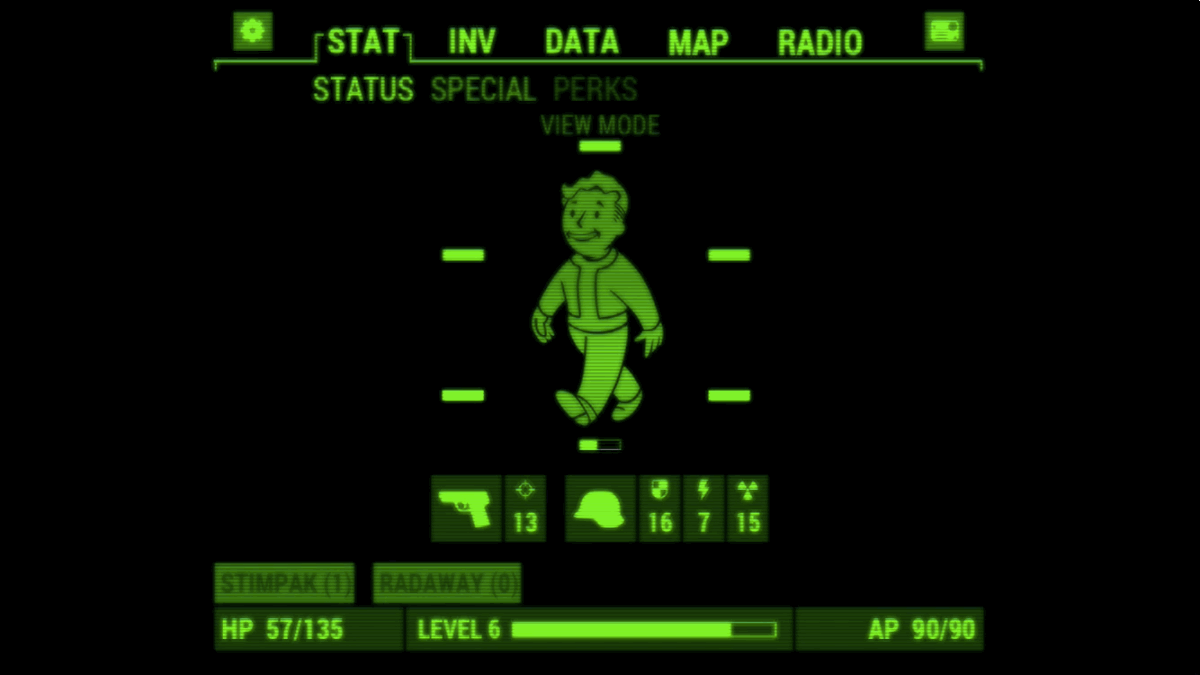
Fallout 4's pip-boy menu shows Stats like total health, armour, stamina, damage, and level on the first screen which is easily accessible and not hidden behind Inventory or any other tab
Conclusion
Cyberpunk 2077 presents a visually rich and immersive world, and the development team has done an impressive job bringing Night City to life. Over the course of multiple updates since launch, the game has already introduced several improvements to the overall user experience, demonstrating the team’s continued commitment to refining and evolving the product.
This review highlights additional opportunities to improve clarity, consistency, and accessibility across key systems, including map design, HUD readability, menu architecture, and driving guidance. By simplifying visual hierarchy, standardizing interaction patterns, and leveraging the game’s futuristic setting for more immersive navigation solutions, the interface could better support player focus and exploration.
These recommendations aim to reduce cognitive load while preserving the distinctive visual identity that makes the game’s interface memorable. This exercise demonstrates how thoughtful interface adjustments can enhance usability while respecting the strong artistic direction and world-building that define the experience.
Version: 2.31
Platform: PlayStation 5
Genre: Action RPG / Open World
Mode: Single Player
Tools Used: Figma, Photoshop
This project is an independent UX case study created for educational and portfolio purposes only.
Cyberpunk 2077 © CD PROJEKT S.A. All rights reserved.
Fallout 4 © Bethesda Softworks LLC. All rights reserved.
Forza Horizon 5 © Microsoft Corporation. All rights reserved.
PlayStation and the PlayStation button icons are trademarks or registered trademarks of Sony Interactive Entertainment Inc.
All game content, screenshots, icons, and trademarks are the property of their respective owners.